The Secret Shapes of Letters: Uncovering the Strange and Beautiful Logic Behind Our Alphabet
he Secret Shapes of Letters: Uncovering the Strange and Beautiful Logic Behind Our Alphabet
“Letters are the footprints of ideas.” — James Gleick
Ever stared at the letter A and wondered, Why does it look like a triangle with a stick in the middle? Or why O is just a circle, yet it means so much?
It’s easy to take letterforms for granted. We use them every day, after all. But their shapes weren’t randomly chosen. There’s a strange and beautiful logic. Behind every curve, stroke, and squiggle in the alphabet. Once you learn it, you’ll never look at letters the same way again. Especially if you’re a curious parent, a passionate student, or a lover of learning.
Let’s dive into how the alphabet got its shape, and what it reveals about how humans think, see, and share stories.
- From Pictures to Sounds: The Birth of Letterforms
Long before “A” was a letter, it was an ox head.
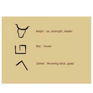
Yes, the very first alphabets were pictographs, symbols representing objects. Thousands of years ago, in ancient Egypt and Mesopotamia, people drew pictures to communicate. Eventually, the Phoenicians simplified these drawings into abstract shapes to represent sounds instead of full words or things.
The letter A (called aleph in Phoenician) represented an ox. Turn it upside down. You can still see two horns!

These weren’t just drawings, they were tools. Tools to make thoughts travel faster. Tools to shape language into something you could carve into stone.
- The Roman Touch: Standardizing the Shapes
Fast forward to the Roman Empire. Letters got a serious makeover.
The Romans inherited the alphabet from the Greeks, who got it from the Phoenicians. But the Romans were engineers at heart. They wanted structure, balance, and proportion, even in their letters.
That’s why Roman letters, like T, E, or L, look straight, symmetrical, and solid. You can almost see the architecture in them, like columns and beams.
They used chisels and stone, so straight lines were easier to carve. That’s why you see so many straight edges in capital letters. It wasn’t just design. It was practicality.
- Why Letters Look the Way They Do
Let’s break down a few familiar shapes:
- B has two bowls. It originally symbolized a house (beth in Semitic scripts). Its double curves? That’s a stylized version of rooms!
- O is a circle, no mystery there. It’s the mouth (ayin), a natural shape when you say “oh.”
- M looks like mountains. That’s because it came from the Egyptian symbol for water, which had wave-like lines.
Some letters are curved because they were easier to write quickly with ink and brush. Others are angular due to carving constraints. It’s a mix of function and form, like all great design.
- The Handwriting Revolution
For centuries, alphabets lived in stone. Then came paper and pens. That changed everything. Monks in medieval Europe began writing manuscripts with quills. Sharp, delicate tools made letters evolve into more fluid, connected forms, what we now call cursive.
Letter shapes were influenced by how hands moved across the page. Try writing S without lifting your pen. It’s one smooth motion, like a dance. This evolution made writing faster. And speed was everything when copying books by hand!
- Typefaces and Technology: How Print Changed Everything
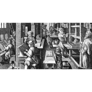
In the 15th century, Gutenberg invented the printing press. Suddenly, letters needed to be uniform. This birthed the idea of typefaces, sets of letters designed to be printed the same way, every time. The shape of a letter wasn’t just about meaning anymore. It was about legibility and style.

Serif fonts (with small strokes at the ends) came from Roman chisels. Sans-serif (without them) came much later, inspired by simplicity and modernism. Even today, when you pick a font like Times New Roman or Arial, you’re choosing from a 2,000-year-old conversation about how letters should look.
6. What Students and Parents Can Do With This Knowledge
So, what’s the takeaway?
For students:
- Sketch letters. Try turning them upside down or breaking them into parts. Understanding their structure improves handwriting and reading fluency.
- Compare fonts. See how different styles change the feel of a text. It’s a mini design lesson!
- Play alphabet games, trace how each letter may have looked in its pictorial form.
For parents:
- Encourage kids to ask why something looks the way it does.
- Visit museums or books with old scripts, turn curiosity into discovery.
- Remind children: letters aren’t random. They carry history, culture, and creativity.
Final Thoughts
The shapes of letters aren’t just decorations. They are ancient, intentional, and deeply human.
When we read or write, we’re not just communicating. We’re participating in a story that began 5,000 years ago, when someone decided to draw an ox, and make it speak.
Now that’s powerful.


